
Your Interior Style Is: Museum Bookstore
Updated: Jan 8

Intrigue lies around every nook and corner in a Museum Bookstore.
WARM ● CONTEMPORARY ● GRAPHIC
Design Influences
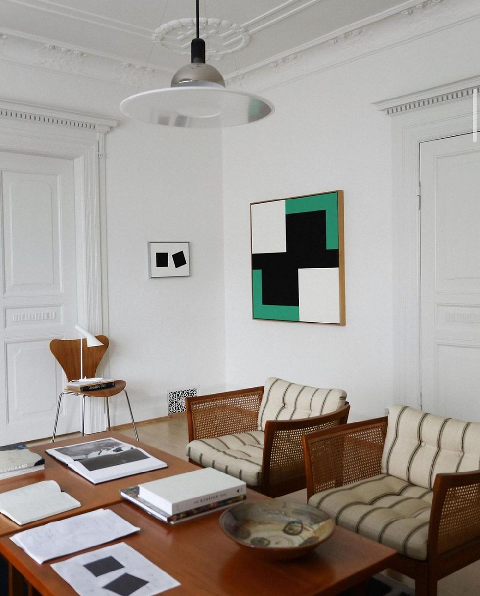
You draw inspiration from Mid-Century modern, Scandinavian, and Japanese design with graphic accent pieces from a range of time periods. And, of course, museum gift shops!


Your color palette
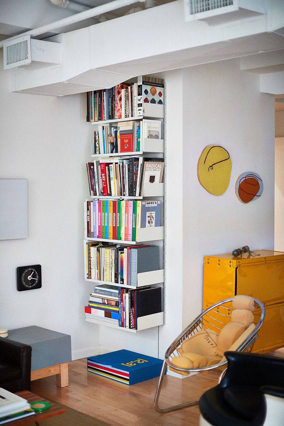
You reach for tans and warm wood colors accented with saturated colors like yellow, blue, and orange.

Shapes
Your dream home is full of repetitive linear shapes and angular furniture.

Materials
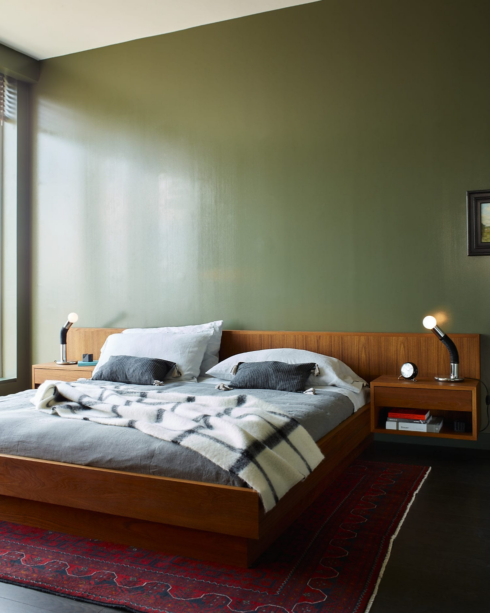
You’re drawn to tactile materials like walnut, concrete, books, plywood, worn leather and plain weave fabrics.
You love materials with understated texture, not high gloss.

Your Challenge
You are drawn to Mid-century design, but you don’t want your home to feel dated or too one-note.
You may have a base of Mid-century shapes and linear forms, but the key is to layer your unique and personal touches on top of this base to give your home more depth. If you have a lot of angular lines, you can help the eye move across the space with curved accent pieces. This can be in the form of artwork, plants, sculptural pieces, pillows or blankets and lighting. And throw in antiques from other eras or new pieces from today’s makers.

If your home doesn't match your Museum Bookstore style...
I created this quiz because so many of my design clients feel overwhelmed by their Pinterest boards and stuck in the analysis paralysis of investing in furniture and art. They say "I don't like this, it doesn't fit but I spent money on it so I have to keep it."
I'm here to help you stop making mistake purchases and start expressing your Museum Bookstore style more cohesively in your home.

If you are Museum Bookstore and another style...
Or you and your partner love Museum Bookstore and another style, then consider this Style Profile for areas where you work or entertain, like the home office or dining area.
This look is ideal for zones in your home where you go to feel productive and inspired.

When you're shopping...
A great starting point is to invest in great shelving. This will be the base that you can build the look of being in an actual Museum Bookstore, and is a hallmark of this Style Profile.
You’re a collector, and you want your belongings to feel artful, not cluttered.
Over time you may rearrange and re-style the objects, books and photos on your shelves. Think of this feature as a key mode of expressing your interests and personality.
What's next?
Your quiz results have given you the language to describe what styles of furniture and decor you’re drawn to, and a list of colors, shapes, and materials to get the look. So you can shop and style your home with an editor’s eye to figure out which pieces truly represent your personal style - and what might be missing the mark.
Book a call with me if you need help closing the gap between your home right now and the personal style you want to be expressing. You can show me your space and ask all of your design questions, from awkward layouts to filling your Big Blank Walls
I want you to get the most out of our call! Here is a handy FAQ guide on What to Expect.
More free resources
Follow me on Instagram @CRISTINACLEVELAND for doable design advice to express your personal style more cohesively in your home.
Subscribe to my YOUTUBE CHANNEL to watch Home School - my series dedicated to helping you develop your personal style at home. Because I believe home design is for everyone, whether we work together or not, no matter your budget.
More people to follow for Museum Bookstore inspiration

@kbergart 
@thepeanutvendor 
@shopwilma 
@joshitiola
Books for inspiration

Handcrafted Modern 
Modern Originals 
Interior Portraits 
Apartamento
More inspiration



Museum Bookstore on Pinterest
Follow me on Pinterest where I'm always adding more Museum Bookstore inspiration.

U888 dạo này mình thấy có người nhắc tới khi nói về các nền tảng giải trí trực tuyến nên cũng thử mở vào xem cách họ bố trí giao diện ra sao. Mình không đi sâu vào nội dung hay từng trò cụ thể, mà chủ yếu quan sát cách các chuyên mục được phân chia trên trang và cách thông tin hiển thị cho người dùng. Nhìn tổng thể thì các khu như thể thao, casino, game bài hay slot thường được sắp xếp theo từng nhóm khá rõ, hiển thị dạng khối và danh sách nên lướt qua cũng dễ theo dõi. Các bảng dữ liệu được trình bày dạng cột khá gọn, giúp quan sát nhanh…
https://thoitiethomnay.org/ca-mau/3-ngay-toi/ mình bấm thử vì đang tính sắp xếp mấy việc ngắn ngày, ai ngờ giao diện nhìn khá dễ chịu. Mình không đọc kỹ từng bài đâu, chỉ lướt xem họ trình bày thông tin thế nào thôi. Trang này có phần dự báo 72 giờ tới cho Cà Mau nhìn rõ ràng, kiểu tách ngày/đêm nên liếc qua là nắm được nhiệt độ với khả năng mưa. Mình cũng để ý họ có ghi giờ cập nhật dữ liệu ngay trên trang, cảm giác thông tin “tươi” nên yên tâm hơn chút. Nói chung không rối mắt, chữ và các khối nội dung canh gọn, và cái dòng thời gian cập nhật nằm ngay gần khu dự báo…
789 win dạo này thấy nhắc hoài nên mình cũng bấm vào nghía thử cho biết. Mình không đọc kỹ nội dung đâu, chỉ lướt xem họ làm giao diện ra sao thôi. Cảm giác đầu tiên là trang nhìn sáng sủa, bố cục chia khối rõ nên kéo xuống không bị rối, kiểu mắt mình tự biết đang xem phần nào. Có đoạn thông tin trình bày dạng bảng cột khá gọn, chữ vừa tầm nên liếc nhanh vẫn hiểu, không bị dày đặc quá. Mình cũng để ý cái menu đặt khá dễ thấy, chuyển qua lại giữa mấy mục không phải mò lâu. Nói chung dùng vài phút thấy ổn vì các khối nội dung được căn…
ColaTV so với mấy trang mình hay dùng trước đây thì đỡ kiểu “mê cung”, vào là thấy ngay lịch và danh sách trận xếp theo giờ thi đấu nên mình chỉ cần lướt nhẹ là biết tối nay có gì, khỏi phải mở thêm mấy tab tra cứu linh tinh. Mình xem thử trên điện thoại, bấm vào trận là nó bật luồng luôn, không có màn bắt tạo tài khoản hay hỏi thông tin cá nhân, cảm giác như đi mua bánh mì mà không bị hỏi hộ khẩu. Nói chung thao tác nhanh. Cái mình thấy tiện nhất là họ để sẵn tỷ số với bảng thứ hạng ngay trên trang, nhìn qua là đối chiếu được…
DK88 mình vừa lướt thử trên mobile cho biết thôi, kiểu mở ra xem giao diện có dễ nhìn không chứ chưa chơi gì. Ấn tượng đầu là họ chia nội dung theo mảng khá rõ, cuộn xuống không bị rối mắt, chữ với khoảng trắng nhìn thoáng nên đọc nhanh vẫn bắt được ý. Mình có thấy họ nhắc con số gần 5 triệu hội viên nên phần giới thiệu nghe có “số má” hơn, không kiểu nói chung chung. Menu đặt chỗ dễ thấy, bấm qua lại mượt, không bắt mình vòng vèo tìm mục. Nói chung cảm giác làm trang gọn gàng, nhất là mấy khối thông tin dạng block và tiêu đề to nên trên màn…