
Your Interior Style Is: Pop Arcade
Updated: Jan 8
You’re not afraid to make bold choices - life’s too short to live in a beige box.
FUN ● UNCONVENTIONAL ● BOLD

Your design influences
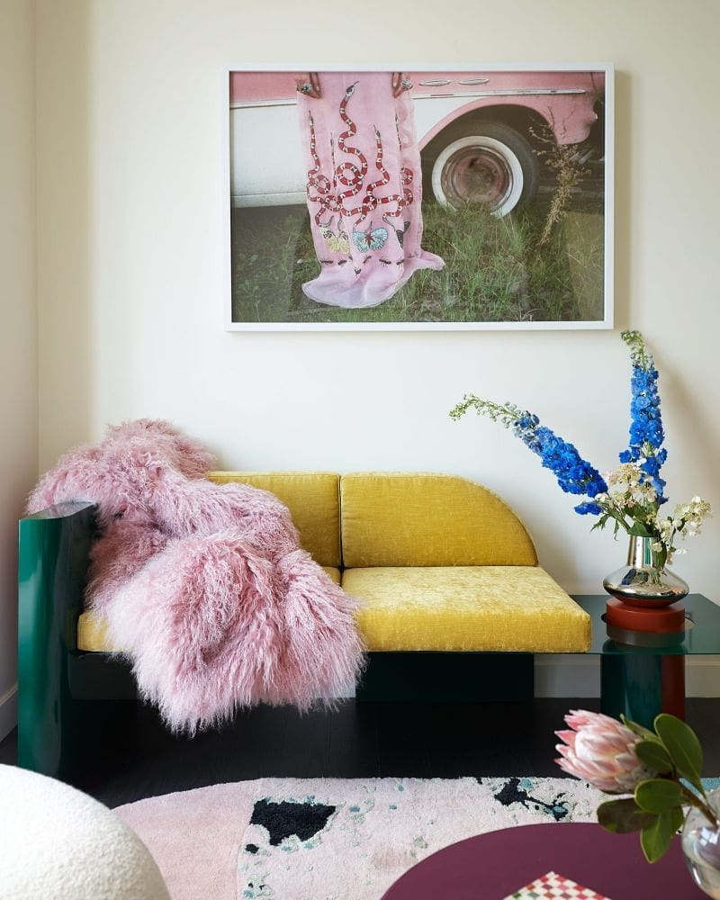
You’re inspired by the Memphis design school of the 1980s, and 1960s Italian design.



Your color palette
You reach for bold, saturated colors like poppy red, canary yellow, kelly green, and royal blue. You can also work in pastel accents. Creative use of color is key to expressing your unique personality.

Your furniture
There's nothing square about you. Your dream home is full of geometric shapes, wavy lines, and circular shapes.

Your materials
You’re drawn to plastic, chrome, glass, linoleum, acetate, and burl wood.

If your home doesn't match your Pop Arcade style...
I created this quiz because so many of my design clients feel overwhelmed by their Pinterest boards and stuck in the analysis paralysis of investing in furniture and art. They say "I don't like this, it doesn't fit but I spent money on it so I have to keep it."
I'm here to help you stop making mistake purchases and start expressing your Pop Arcade style more cohesively in your home.

If you are Pop Arcade and another style…
Or you are Pop Arcade and your partner or roommate is another style, then consider this Style Profile for areas where you entertain, like the living room or dining area.
This look is ideal for zones in your home where you go to feel lively, creative and playful.

When you’re shopping…
Before you make a purchase ask yourself, “how would I describe this table/art/chair?” Make sure it aligns with at least one of your keywords: fun, bold, unconventional.
Not every single piece in your home needs to be bold - you can start with a neutral base like a white or brown sofa. Then look for opportunities to inject your unique personality.
For example, shop for accent chairs or dining chairs in bright colors with chrome accents. Mirrors in geometric shapes. Art in primary colors. Look for reflective surfaces like the metal shelves and plastic dining table above.

Your challenge
You love bright accents and quirky pieces, but struggle to create cohesion in your space. Your vision is a dynamic one, but the execution can sometimes feel messy and not quite hit the mark. Start by getting focused about how you need this room to function for you and your lifestyle. Your needs should guide your design decisions, so you don’t get distracted by all the fun pieces you find. Once you have your space laid out and working for your lifestyle, then you can add the layer of personality on top!
Create a focal point in the room where you can corral and display all of your collected items. This will make it feel more like a well-considered show piece and less like clutter.

The shelves above are actually inexpensive Home Depot shelves in the home of Great Jones founder Sierra Tishgart. Edit the amount of items you display on your shelves to elevate your objects and make it feel more like a boutique, less like clutter.

In my Brooklyn home, I used Ikea Elvarli shoe shelves to create a focal point and demarcate my dining area in an open space. Open shelving like this is a great place to display and store books, records, ceramics, art, and any decorative objects you've collected that express your personal style.
We all have things that are necessary but can create visual clutter - anything with cords, wires, or pieces that just don't accurately reflect your style. Those items are best kept organized in concealed storage (like cabinets, drawers, anything with doors). Intentional use of open and concealed storage will help keep your Pop Arcade vision clear.
What's next?
Your quiz results have given you the language to describe what styles of furniture and decor you’re drawn to, and a list of colors, shapes, and materials to get the look. So you can shop and style your home with an editor’s eye to figure out which pieces truly represent your personal style - and what might be missing the mark.
Book a call with me if you need help closing the gap between your home right now and the personal style you want to be expressing. You can show me your space and ask all of your design questions, from awkward layouts to filling your Big Blank Walls.
More free resources
Follow me on Instagram @CRISTINACLEVELAND for doable design advice to express your personal style more cohesively in your home.
Subscribe to my YOUTUBE CHANNEL to watch Home School - my series dedicated to helping you develop your personal style at home. Because I believe home design is for everyone, whether we work together or not, no matter your budget.
More people to follow for Pop Arcade inspiration


Books for inspiration

How to Live With Objects 


More inspiration


Pop Arcade on Pinterest
Follow me on Pinterest where I'm always adding more Pop Arcade inspiration.

Naming Memphis and nineteen-sixties Italian design as the influences is what makes this quiz land - the palette advice only means anything once the reference points are that specific.
Clients who stall on furniture decisions often respond better to motion than to mood boards. A few seconds showing how a saturated colour reads against a wall, or how a wavy silhouette sits in a room, breaks the analysis paralysis faster than another Pinterest board does.
AI Fruit generates short stylised clips from a text prompt when you want something quick to react to: https://www.aifruit.net/
Khi đọc các bài giới thiệu nền tảng giải trí, tôi thường thích những bài viết ngắn gọn để có thể xem nhanh trên điện thoại. Bài viết này có bố cục khá dễ theo dõi khi phần nhắc đến xx88 được đặt ở giữa nội dung. Điều đó giúp mạch bài trở nên tự nhiên hơn và không tạo cảm giác quảng cáo quá sớm. Nội dung tập trung vào trải nghiệm chung của người dùng với giao diện dễ sử dụng và nhiều danh mục quen thuộc như slot, game bài hay mini game. Nhìn chung cách diễn đạt khá nhẹ nhàng và dễ hiểu.
pg99 dạo này mình thấy có người nhắc tới khi nói về các nền tảng giải trí trực tuyến nên cũng thử mở vào xem cách họ bố trí giao diện ra sao. Mình không đi sâu vào nội dung hay từng trò cụ thể, mà chủ yếu quan sát cách các chuyên mục được phân chia trên trang và cách thông tin hiển thị cho người dùng. Nhìn tổng thể thì các khu như thể thao, casino, game bài hay slot thường được sắp xếp theo từng nhóm khá rõ, hiển thị dạng khối và danh sách nên lướt qua cũng dễ theo dõi. Các bảng dữ liệu được trình bày dạng cột khá gọn, giúp quan sát nhanh…
If you like testing your reasoning skills with short puzzles, Scrandle could be a fun addition to your routine. I’d be interested to hear which strategies other players use when they get stuck.
https://thoitiethomnay.org/ca-mau/hang-gio/ mình bấm vào thử vì đang cần coi thời tiết Cà Mau theo giờ, ai ngờ giao diện nhìn khá dễ chịu. Trang hiển thị luôn tình trạng hiện tại kiểu “26°C, trời âm u”, kèm gió với độ ẩm nên mình liếc cái là nắm được ngay, khỏi phải mò nhiều. Mình cũng thích cái bảng 24 giờ tới, nhìn theo từng dòng nên so nhanh giờ nào dễ mưa hay nóng hơn khá tiện, nhất là lúc chuẩn bị ra ngoài. Không có cảm giác rối mắt, thông tin nằm gọn theo khối nên cuộn xuống đọc vẫn mượt. Nói chung mình chỉ cần kiểu trình bày rõ ràng vậy thôi, và phần bảng nhiệt độ/khả năng…